-
Madison, WI
608-277-7849 -
La Crosse, WI
608-713-7001 -
Benton Harbor, MI
269-612-4200 -
Eau Claire, WI
715-502-2777 -
Rockford, IL
815-327-0101 -
South Bend, IN
574-310-8077 -
Springfiield, MO
417- 886-5677
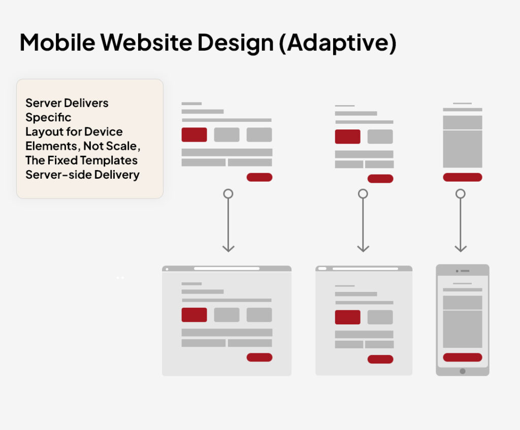
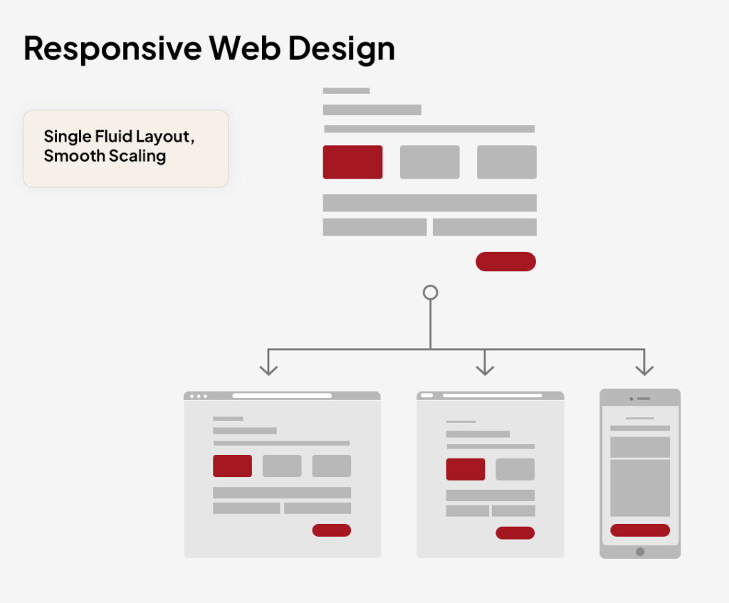
Web Design
Web Design
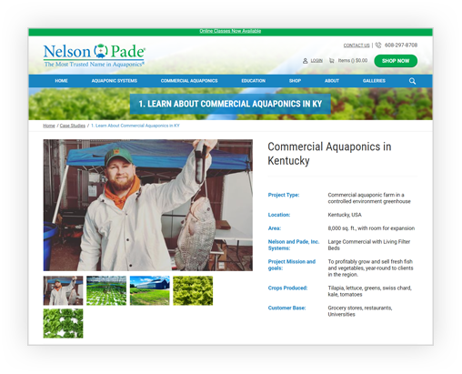
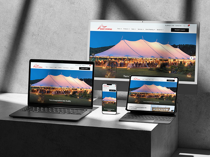
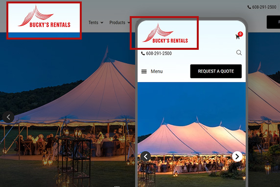
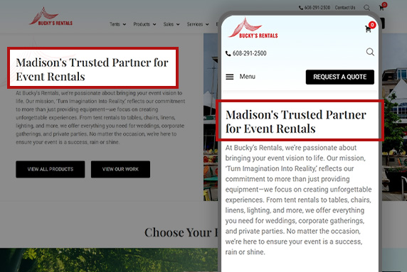
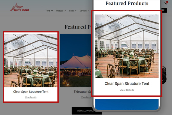
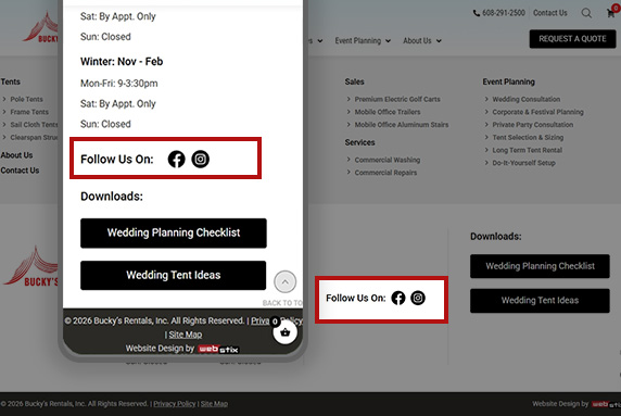
Professional Web Design Services That Turn Visitors Into LeadsWe create strategic, conversion-focused websites built with modern web design and SEO best practices to help your business generate leads and grow.
Request a Website ReviewIndustrial web design
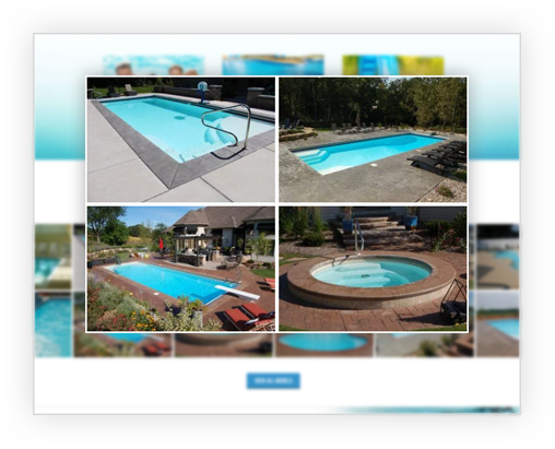
Industrial Web Design, Done RightGet a website that grows with your industrial business goals.
View Our Industrial Web Design ServicesServices
Hosting & Infrastructure
Design & Development
Marketing & Business Services
About
Locations
01
Madison, WI730 Rayovac Dr.
Madison, WI 53711608-277-784902
La Crosse, WI201 State St.
La Crosse, WI 54601608-713-700103
Benton Harbor, MI580 East Napier Ave.
Benton Harbor, MI 49022269-612-420004
Eau Claire, WI944 Harlem St.
Altoona, WI 54720715-502-277705
Rockford, IL2830 Sandy Hollow Rd. Rockford, IL 61109815-327-010106
South Bend, INP.O. Box 960
South Bend, IN 46624574-310-807707
Springfield, MO2453 E Elm Street
Springfield, MO 65802417-886-5677Talk to a design lead 608-277-7849


