Probably the most complex task about owning and running a website is working with images. You need your website to load quickly and work well on all devices. Even though website software like WordPress helps you get images onto your website quite easily, there are some things you should know to make working with images even easier.
This article will give you a guide and tips to working with images on your website. First, a table of contents since there's a lot here...
Finding good images for your website is important. If you have good photos, then use those but you definitely want them shot professionally. Things like lighting, depth and framing can make a huge difference. If you can't afford a photographer, then definitely use stock photos instead of your own. Just as good images can make a website look great, bad looking images can make it look terrible.
Here are some resources:
You're going to need it. There is software included in Windows (Microsoft Photo Editor) but we highly suggest getting something better like PhotoShop or Paint Shop Pro (less expensive).
When working with a content management system and images on a website, as we explain, it's important that they are the right size before they get uploaded to the server. Resizing an image by grabbing the handlebars on the sides will not make the file size any smaller, it'll only display it in a smaller space. People will take a picture with a digital camera and then upload it to their site without resizing it and it then comes in really slowly (line by line) when it looks like a small image. They didn't resize it properly. To do that, you need image editing software like Photoshop.
Programs like Photoshop can be expensive. The Photoshop Elements version costs less but sometimes people just want to do simple things like a resize or crop. Here are some resources for some cheap or free image editing software:
GetPaint.net - I haven't tried this one but I've heard good things about it. It seems to do the job. It's free and it's for Windows.
GIMP - I have used this one. If you're familiar with Photoshop, then this one will work well for you. It's free for Windows, Mac OSX and other platforms.
GimpShop - This is Gimp but in a familiar, Photoshop format.
Photoshop.com - Edit images online, in your web browser. I've tried this and it works. It's not as fast as I'd like but worth checking out.
Paint Shop Pro - This one I've used for years. It's really great, fast and easy to use. You do have to buy it but you do usually get some extras and I believe in paying for good software.
We also have some good resources on our Links page.
To work with the CMS like WordPress, you should also make sure you do have some good image editing software. It's a tool that you will need.
 Your website needs to load fast, so a part of making sure that happens is optimizing images. Optimized images look good but the file size is small.
Some good tools to use to optimize images are:
Upload images there first and then use the optimized images on your website. It's an extra step but realize that images you post on your website will essentially live there forever (or a long time), so this step is worth taking. A fast-loading website is very good for SEO (hint, hint).
Getting images onto a website is probably one of the more challenging tasks out there - but it doesn't have to be. If you know a few tricks, you'll get through it a lot easier. Here are some common pitfalls and ways to avoid using images badly on your website.
Make sure that you are resizing images first in Photoshop (or any photo editing software) before uploading them to the website and not using those handle bars on the page to shrink things down.
What happens is, people are downloading the exact file you're uploading - no matter if you're specifying that it be shown larger or smaller on a page. Do you ever see an image loading really slowly - like line by line, going nowhere? Well, that's not really a slow Internet connection, it's a bad Webmaster. They're actually using an image that's too big and just showing it smaller - making it load too slowly.
Let's say you have an image (hiring-now.jpg is my sample image below) that's 786 kb with the dimensions of 2624 x 1968 pixels (width x height) and you want to put it on your website. If you upload that image through the CMS, then you've just uploaded a 786 kb file to the server.
You're using that image on a page but it looks too big, so you use those little handlebars (the corner ones so that you maintain the correct proportions) to shrink it down to a respectable size - like this:
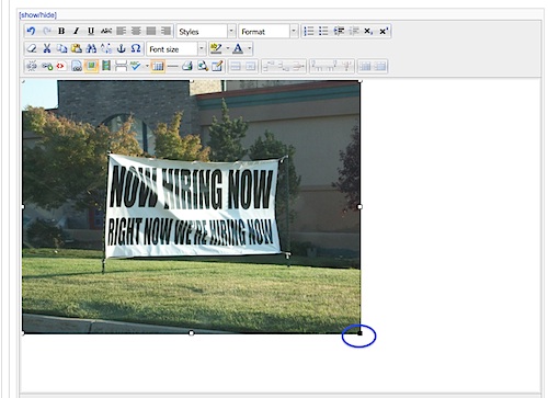
It's now being shown at 500 x 375 pixels instead of 2624 x 1968 pixels. It's smaller... in appearance.
You think you've corrected things with that handlebar move but you really haven't. People that visit that page are still downloading that 786 kb file that you uploaded. It's just shown at the dimensions of 500 x 375 instead of 2624 x 1968 pixels. It's still the same file. It hasn't changed. It also doesn't look as good now because it's being scrunched. This page will take a few seconds longer to download. You will also get charged for the bandwidth of the larger image even though your web page is showing it at a smaller size.
Here is an example of doing this wrong (opens in a new window).
The proper way / best practices:
Here are the steps to do this the right way:
That's it. The steps are simple but important. That new image is now ready to upload to the website. Compare file sizes and you'll see the difference. Know that people will be downloading any image that you put on your website thousands of times. If you save 200 kb with an image, you're saving a lot of bandwidth!
Some additional image optimization tips:
Just don't throw images here and there - plan it out! That web page is most likely going to be worked on once and left there on the web indefinitely. Since it'll be there a while (if not forever), do a good job with it so that it stands the test of time.
The first thing you need to know is how much space you have to work with. With most website templates and those built with a specific design in a CMS like Joomla or WordPress, the space you have for content is somewhat limited - mainly the width. You don't want people to scroll left and right on your web page, right? That's why Webstix designs with width in mind. We check to see what the most popular computer monitor resolution is and design so that most people with modern computer monitors will not have to scroll left and right. Scrolling vertically is fine, of course, so that's why we're concentrating on width.
Take a screen shot of your website, open it up in Photoshop and then crop it so that just the content area is showing. Measure it (find out how many pixels wide it is) and there you go. That's the width of the area you have to work with. Mac users can just take a screen shot (command + shift + 4) and you'll be able to measure it as you're taking the screen shot.
For example (and to keep things simple), let's say that came out to 600 pixels wide. That means the widest image you'll want to use on that page is 600 pixels (or a few pixels under that).
You could do several layouts - so, like we said - think about layout. The easiest way to think about your layout options is to think about splitting that width into 3 columns. Each one will be 200 pixels wide.
|
Option 1: Columns 1 & 2 have text, column 3 has an image (wrapped text). |
Option 2: Column 1 has an image, columns 2 & 3 have text (wrapped text). |
Option 3: One row is an image, another row is all text (not wrapped). |
With options 1 and 2, the image you're using with have a width of 200 pixels or so since that image is taking up that whole imaginary column. With option 3, you're simply putting an image above or below a paragraph of text.
Option 1 is a good way to go. People naturally get done reading a line of text and go all the way to the left to continue reading the next line. Having an image there may jar things or have them quickly search for where the text starts.
Option 2 is fine, too. Vary your images left and right throughout your text.
Why aren't we saying inches?
Well, quite simply... what is an inch? There aren't inches on computer monitors - there are pixels. How many pixels you'll have per inch will depend on what resolution a user's computer monitor is set at and what size monitor they have. Since not everyone out there is using the same sized computer monitor with the same settings, we don't know how many inches something will be displayed as. We don't. So why use inches? It's a useless measurement with website graphics and images.
Taking Pictures for the Web
There is a lot that could be said about how to take good pictures. Here are just a few ideas and comments to try to help you out.The quality of images that you put on your website is important. Pictures that look grainy or that have poor lighting are not doing your website justice - especially if they are pictures of your products. Using only one light source (like a flash) will make your images look flat... things like this is what we're talking about.
Hiring a professional to take really good pictures can very well be worth the investment. Not only will you be able to use these pictures on the website but you can also freshen up your other marketing.
Some tips:
In general, how your photos look will say a lot about how your branding your company and your products. A picture is worth a million words, right? Make sure those are good words, not bad ones.
These few tips on how to use images on the web can save you some headaches. Try them out. Good luck!


