
People don’t visit websites to admire UI tricks—they come for answers. In 2025, “make me click to see it” loses to “it’s right there.” People need answers right away.
How good is your website at TTFA: Time to First Answer?
This article lays out when to show content, when it’s OK to hide it, and how to measure if your pages deliver answers faster.
Attention is scarce. Search results and AI both normalize instant answers, so tolerance for extra clicks keeps dropping. If your key info is hidden, many visitors won’t dig for it—they’ll bounce or ask a tool that responds in plain text. The fix isn’t complicated: reduce interaction cost and surface the answer with reducing Time to First Answer.
Show answers by default. Hide content only when one of these applies:
Don’t hide explanatory or decision-making content. If users can’t easily guess what’s inside, keep it visible.
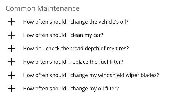
This goes for FAQs - don't do the fancy "we need you to click to open it" accordion kind of thing. That doesn't fly anymore. Show what's there instead of making people click to see it:
prefers-reduced-motion.“I opened a page, hit a wall of accordions, and bailed.” That reflex is common now. When the first screen shows a clear answer (or TL;DR), people stay. When it shows gates and clicks, they leave. This isn’t about being fancy; it’s about reducing friction.
A regional service company had strong offers but hid proof—FAQs, warranties, next steps—behind accordions. We opened FAQs by default, added a three-bullet TL;DR, and moved the “Get a Quote” form into first scroll. Conversions rose and “What happens next?” emails dropped. Same content; better visibility.
An e-commerce page buried key specifications under “More details.” We brought the top five answers into the open and kept the rest behind “Show more specifications (+27).” Shoppers got unstuck and progressed deeper into the funnel. The win came from clarity, not more content.
A redesign added clever animations and delayed reveals. Demos looked great, but users with reduced-motion preferences saw awkward fallbacks and missed cues. We pared back motion, honored prefers-reduced-motion, and surfaced answers above the fold. Support tickets about “I can’t find…” tapered off.
Most pages fail before the headline is done—not because the design is ugly, but because the answer is hidden. Lead with the answer. Everything else supports it.
Make one change at a time, observe for a full cycle (traffic seasonality matters), then iterate.
And let's officially coin that term, if it hasn't been done already: TTFA as Time to First Answer. That is what it's about today. How far down on a page do people need to get to find the answer they need? This is worth measuring.
Visibility beats cleverness. In a world trained to expect instant answers, the pages that win are the ones that get people to what they came for—fast. Show answers by default, keep motion light, and measure whether visitors find what they need without friction.


")


